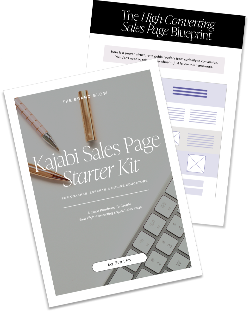
10 Essential Elements For A High-Converting Sales Page
You can drive all the traffic in the world to your offer, but if your sales page isn’t built to convert — it’s like pouring water into a leaky bucket. A high-converting sales page isn’t about flashy design or clever copy alone. It’s about structure, psychology, and clarity. When these 10 essential elements work together, selling becomes natural and effortless.
Let’s break down what every effective sales page must have.
1. A Clear, Benefit-Driven Headline
Your headline is the make-or-break moment. If it fails, the rest of your page doesn’t matter.
Avoid cleverness. Aim for clarity.
A strong headline should answer:
- What is this?
- Who is it for?
- Why should I care?
Example:
“Attract your first 3 dream clients in 60 days — without chasing leads.”
Instant understanding. Instant desire.
2. A Powerful Hook That Agitates the Core Problem
Your introduction should tap into the emotion your ideal customer is already feeling.
You’re not creating new fears — you’re mirroring existing frustrations.
Example structure:
- “You’ve tried ___ but still struggle with ___.”
- “You’re doing everything ‘right’ but ___.”
- “Every time you ___, you think, ‘There has to be an easier way.’”
This creates connection and resonance. Before they trust your offer, they need to feel seen.
3. A Compelling Promise or Big Claim
Once you’ve empathized with their pain point, present your solution with confidence.
This is your value proposition, and it should feel bold yet believable.
Good examples:
- “Get 10 high-quality leads per day — without ads.”
- “Publish your first online course in 14 days.”
- “Book your first client even if you have no portfolio.”
A weak offer won’t convert no matter how beautiful your page is. A strong offer almost sells itself.
4. Persuasive Storytelling or Origin Story
People don’t just buy products — they buy the journey behind them.
Share a brief story:
- How you struggled with the same problem
- What breakthrough you discovered
- Why you created this solution
This builds trust, relatability, and authority — all in one sweep.
5. Clear Breakdown of Features with Benefits Translated
One of the biggest mistakes? Listing features without context.
Customers don’t buy “8 coaching modules.” They buy “clarity, confidence, and momentum in 8 structured phases.”
When listing your offer, always format like this:
- Feature ➝ Benefit
Example:
- Weekly live calls → So you never get stuck or lose motivation.
- Private community → So you’re surrounded by people who actually understand your goals.
- Done-for-you templates → So you can launch faster with zero guesswork.
Never assume your audience will connect the dots — do it for them.
6. Social Proof That Addresses Doubts
Testimonials are essential, but not all testimonials are created equal.
Use results-focused, objection-busting proof.
The best testimonials answer:
- “I was skeptical because ___, but after using this…”
- “I tried other programs before, but this is different because…”
- “I didn’t think it would work for me, but…”
Even if you have no testimonials yet, you can:
- Highlight beta testers
- Use screenshots from conversations
- Add industry statistics supporting your method
Proof = credibility. Without it, your offer feels like a risk.
7. A Simple, Well-Structured Offer Stack
At the purchase moment, clarity reduces hesitation.
Break down exactly what they get and what it’s worth.
Example:
|
Component |
Value |
|
8-Week Training Curriculum |
$997 |
|
4 Live Q&A Calls |
$600 |
|
Done-for-You Scripts & Templates |
$497 |
|
Private Support Community |
$300 |
Total Value: $2,394
You Pay Today: $497
This isn’t about inflating numbers — it’s about anchoring value so your price feels like a no-brainer.
8. Payment Options
People love choice — but not too much of it.
Ideally, offer:
- One full-pay option (best value)
- One installment plan (more accessible)
To increase conversions, use price contrast:
“Instead of spending $2,500 figuring out marketing on your own… follow a proven client-attraction system for $297.”
This taps into perceived savings, which significantly increases buying motivation.
9. Urgency or Scarcity (Used Ethically)
If there’s no reason to buy now, most people won’t.
You can inject urgency with:
- Limited bonuses
- Early bird pricing
- Cohort start dates
- Limited seats
Important: urgency should be real, not fake. Customers are smart — and distrust is fatal to conversions.
10. A Frictionless Call to Action — Repeated Throughout
Don’t make people scroll endlessly to find your “Buy Now” button.
Place CTAs:
- Above the fold
- After key sections
- At the bottom
Each CTA should be action-oriented and feel motivating.
❌ “Submit”
✅ “Yes, I’m Ready to Start!”
✅ “Get Instant Access Now”
Avoid weak phrases like “Learn More”. Use commitment language that mentally primes the decision.
Bonus Conversion Boosters
These aren’t mandatory — but they can dramatically lift conversions.
✅ FAQs That Handle Objections
Load your FAQ section with sales objections, not logistical ones.
Instead of:
- “How long do I have access?”
Use:
- “What if I’ve tried similar programs before and they didn’t work?”
- “What if I don’t have time right now?”
✅ Money-Back Guarantee
This lowers resistance and increases trust.
Examples:
- 30-Day Risk-Free Trial
- “Do the work, and if you don’t see results, I’ll refund you.”
✅ Visual Mockups
If you're selling a digital product, show it.
Even simple mockups of screens or templates dramatically increase perceived value.
Final Thoughts: Selling Is Serving
At its core, a sales page isn’t about pushing — it’s about guiding.
When you structure your page with empathy, clarity, and confidence, selling stops feeling like selling. It becomes an invitation.
Whether you’re DIY-ing your own sales page or hiring a designer, make sure these 10 elements are baked in. Because when the right message meets the right structure — conversions happen naturally.
Hello & Welcome

Let Your Light Shine,