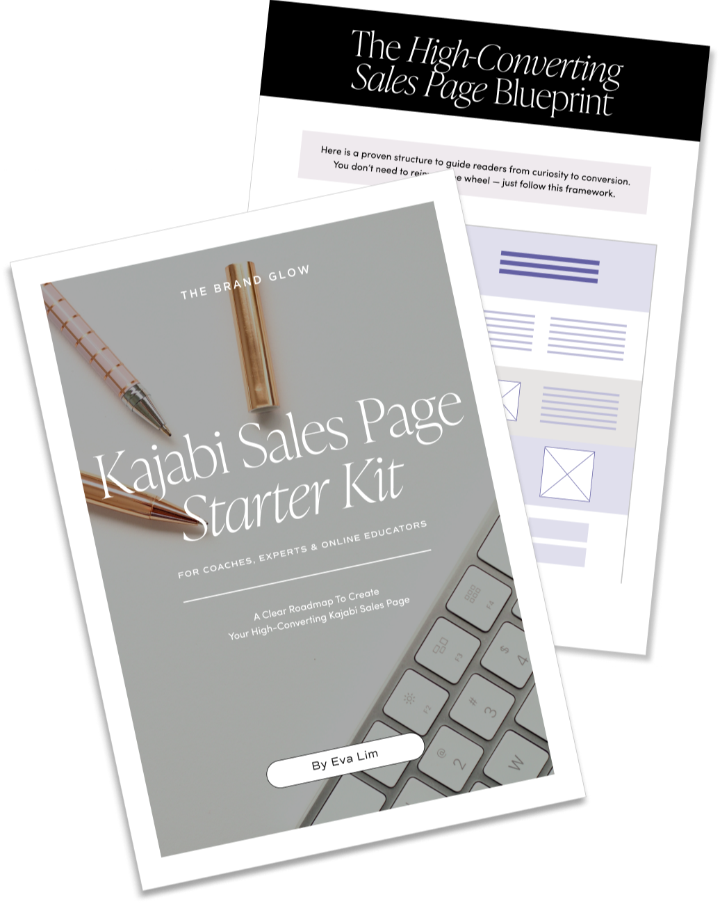
15 Quick Sales Page Design Tips To Boost Conversions
Most sales pages focus heavily on copy. While headlines and storytelling are important, how your page looks and feels can make or break conversions. A cluttered or confusing page turns visitors away — even if your offer is amazing.
A well-designed sales page guides visitors naturally from curiosity to confidence. Here are some of my best tips to help your page look polished, feel trustworthy and convert effectively.
1. Define Your Vibe With a Moodboard
Before building your page, first define the feeling you want to convey. Then use it as a guide to decide on visual elements such as:
-
Fonts: 2–3 complementary fonts (heading, body, accent)
-
Color Palette: 3–5 colors
-
Imagery: photography, illustrations and/or patterns
Why it works: Great design makes your brand memorable and sparks curiosity, encouraging people to learn more about you.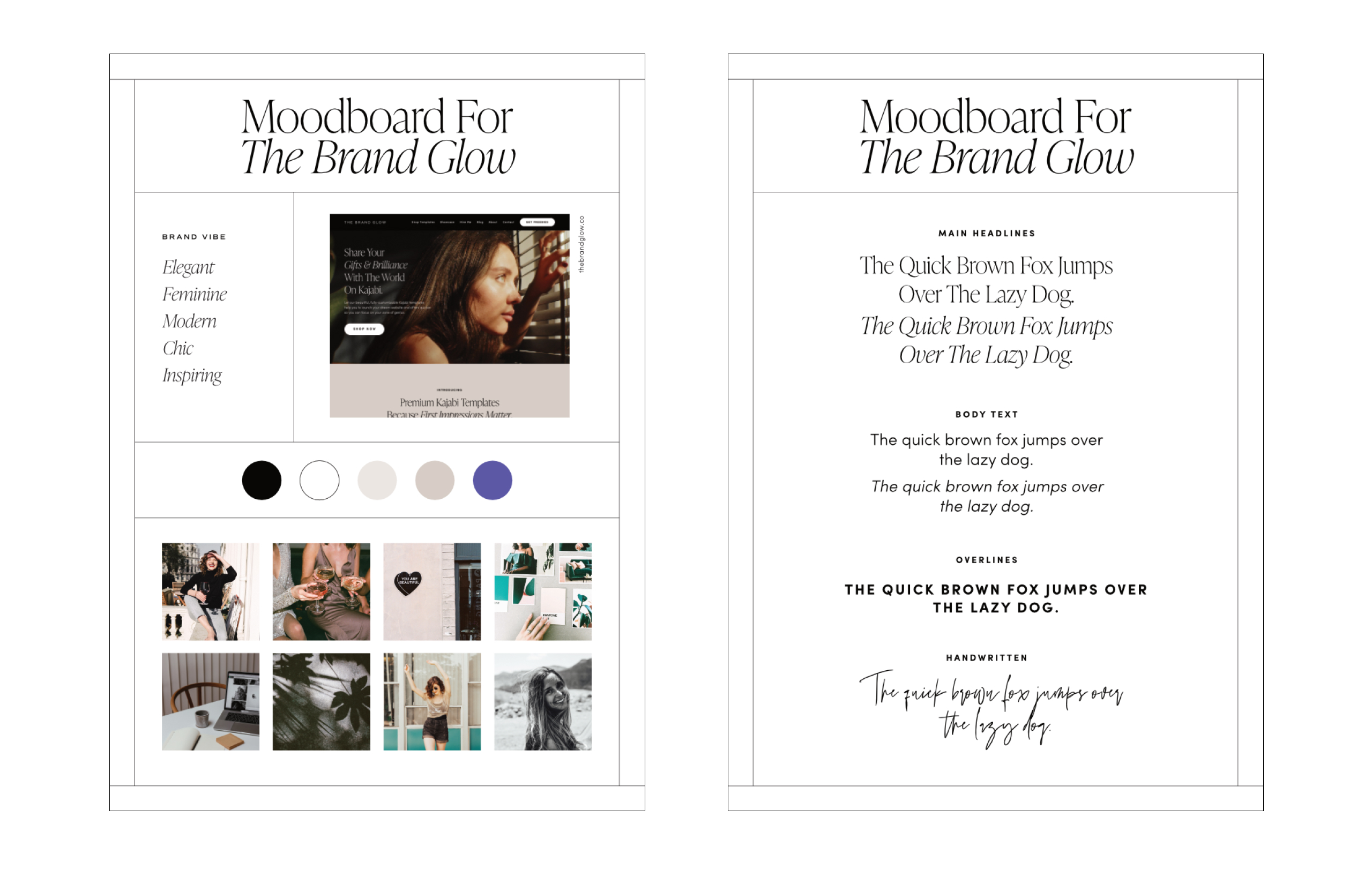
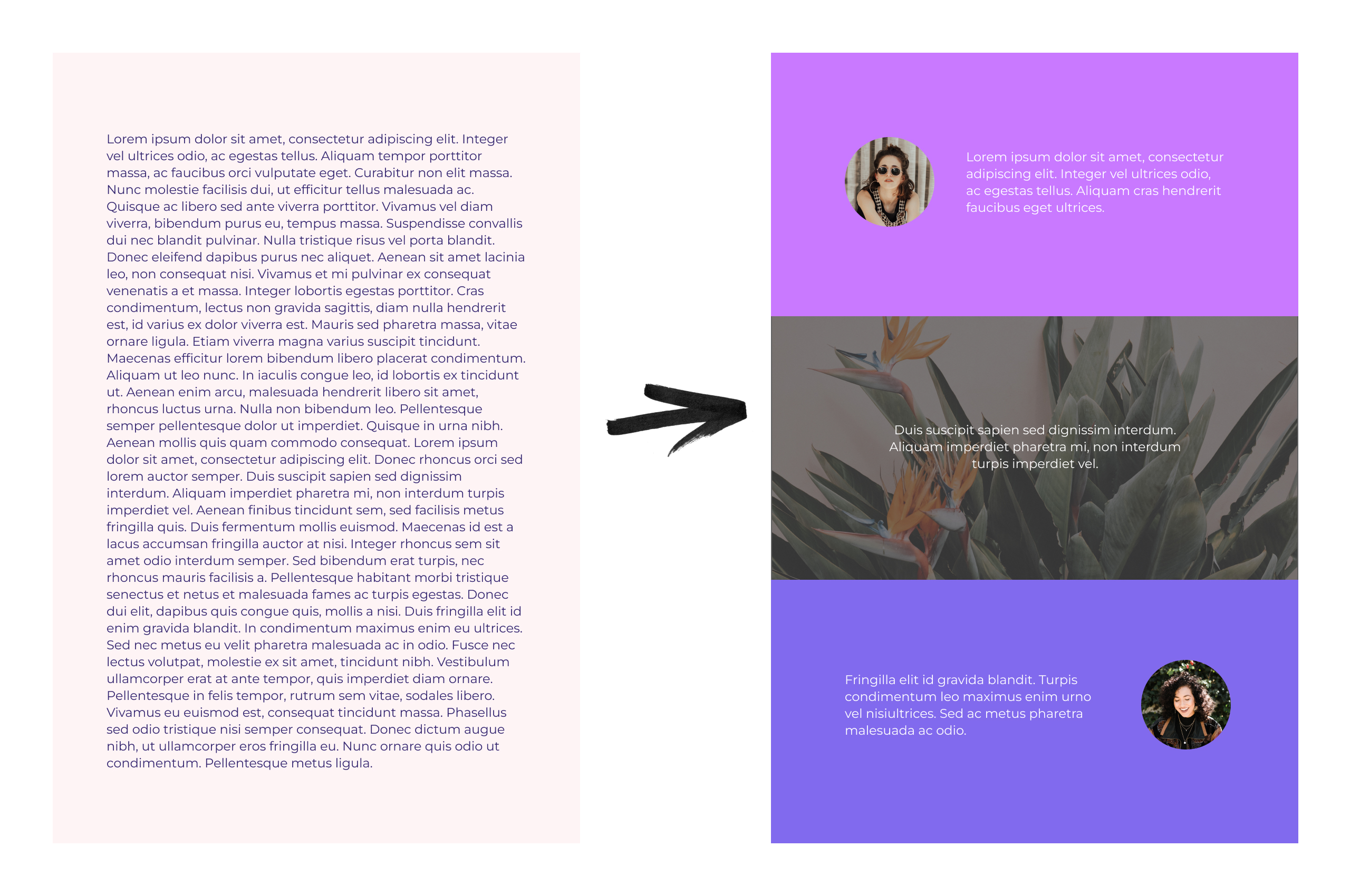
2. Break Up the Page With Color Blocks and Section Backgrounds
Long walls of text are overwhelming. Break them up by using:
-
Solid color sections for contrast
-
Image or pattern backgrounds
-
Alternating text-image layouts
Why it works: Sections guide the eye, reduce fatigue, and make content easier to digest.
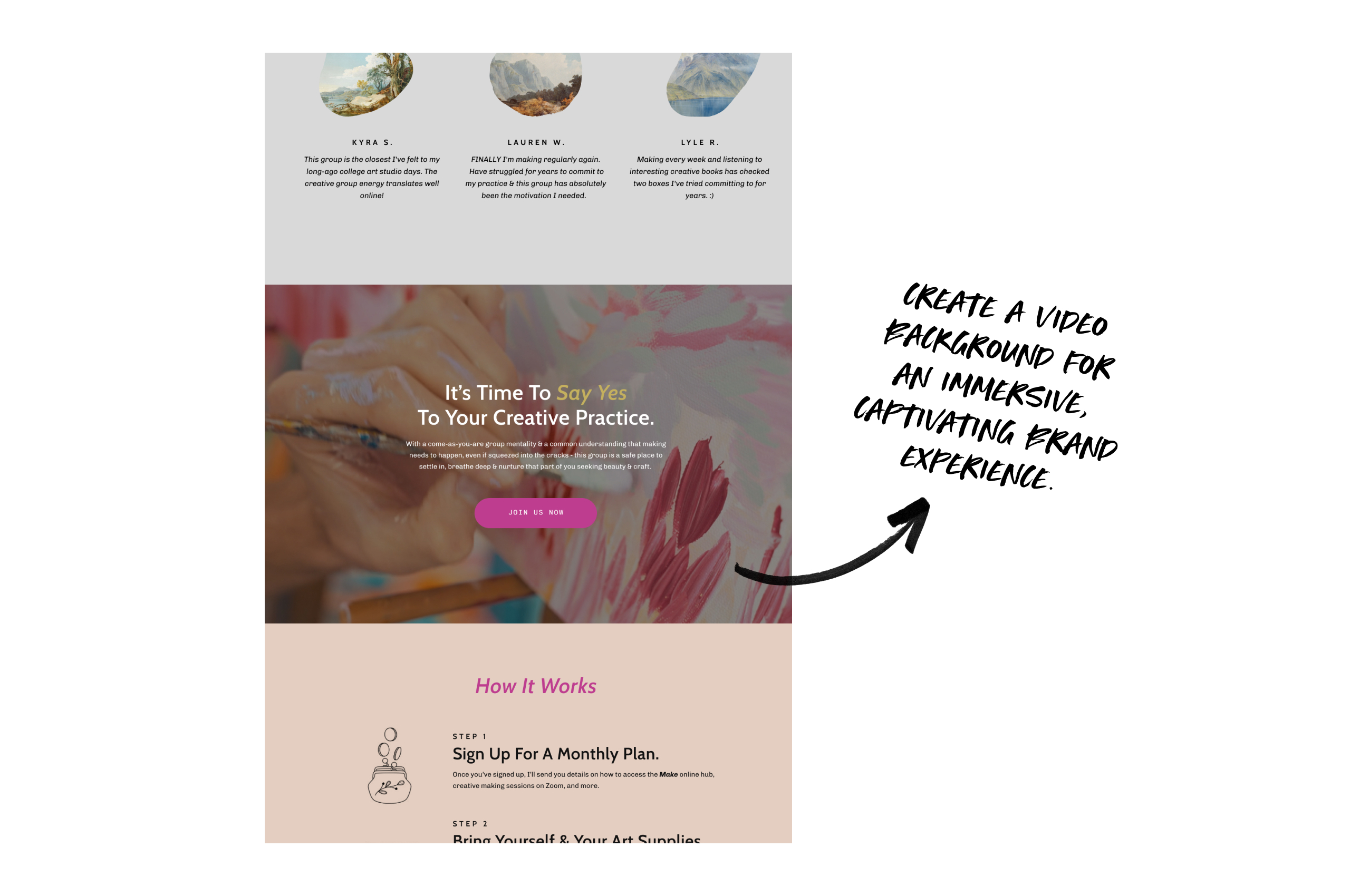
3. Add Subtle Video Backgrounds
Videos create energy and interest without clutter.
-
Short loops (<15 sec)
-
Muted, subtle movement
-
Supports your brand vibe
Why it works: Motion draws attention and modernizes the page.
4. Keep Copy Short and Snackable
How text is presented affects readability.
-
Short paragraphs (1–3 lines)
-
Bullet points for features or benefits
-
Clear, descriptive headers
Why it works: Skimmable content helps visitors quickly understand your offer.
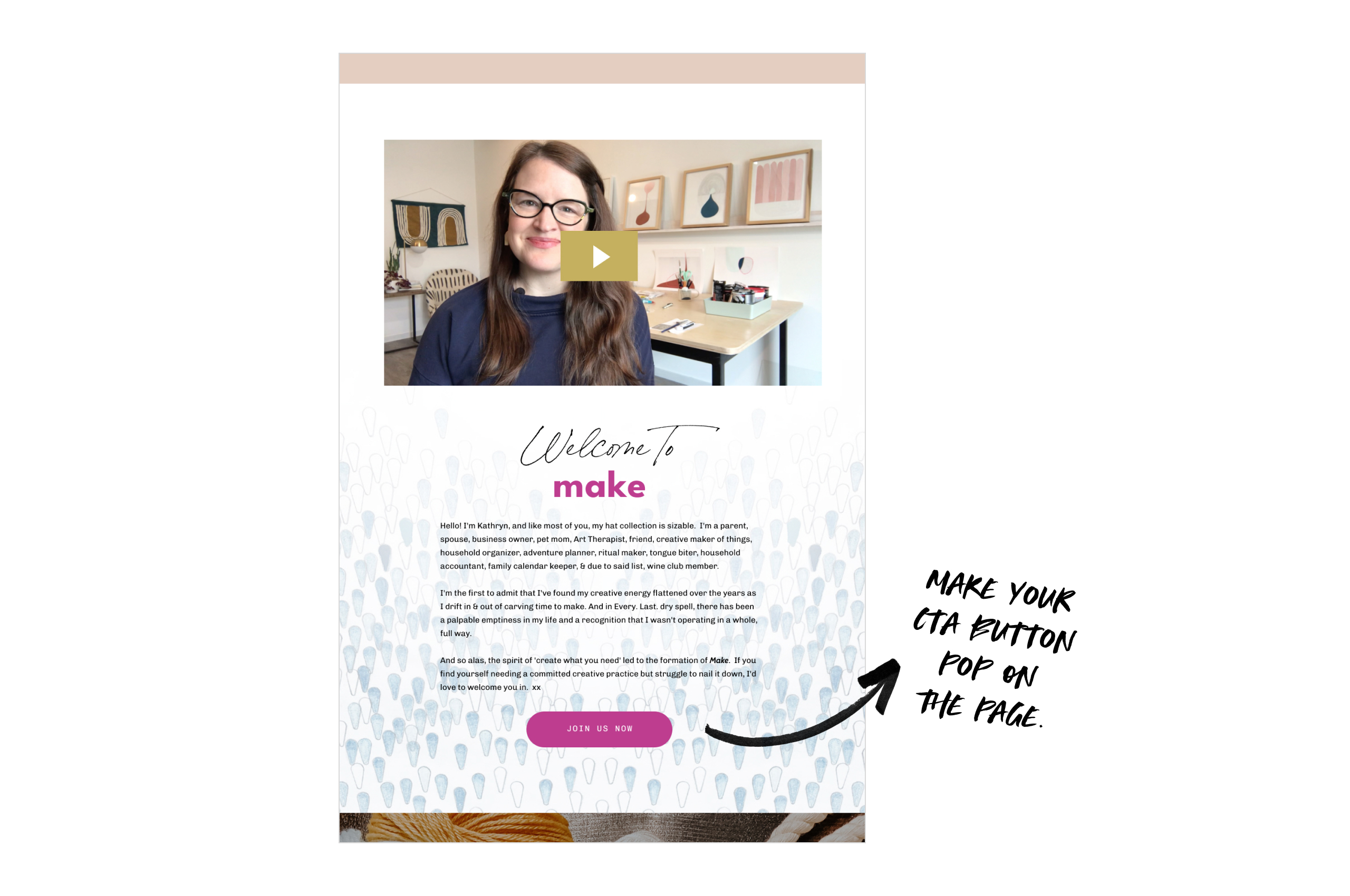
5. Use Prominent CTA Buttons
Your call-to-action should stand out.
-
Large and bright
-
Repeated throughout the page
-
Easy to click on any device
Why it works: Multiple CTA points reinforce action and reduce friction.
6. Remove Distractions
Keep visitors focused on the offer.
-
Remove top navigation and blog links
-
Minimize footers
-
Avoid external links
Why it works: Less distraction = higher completion rates.

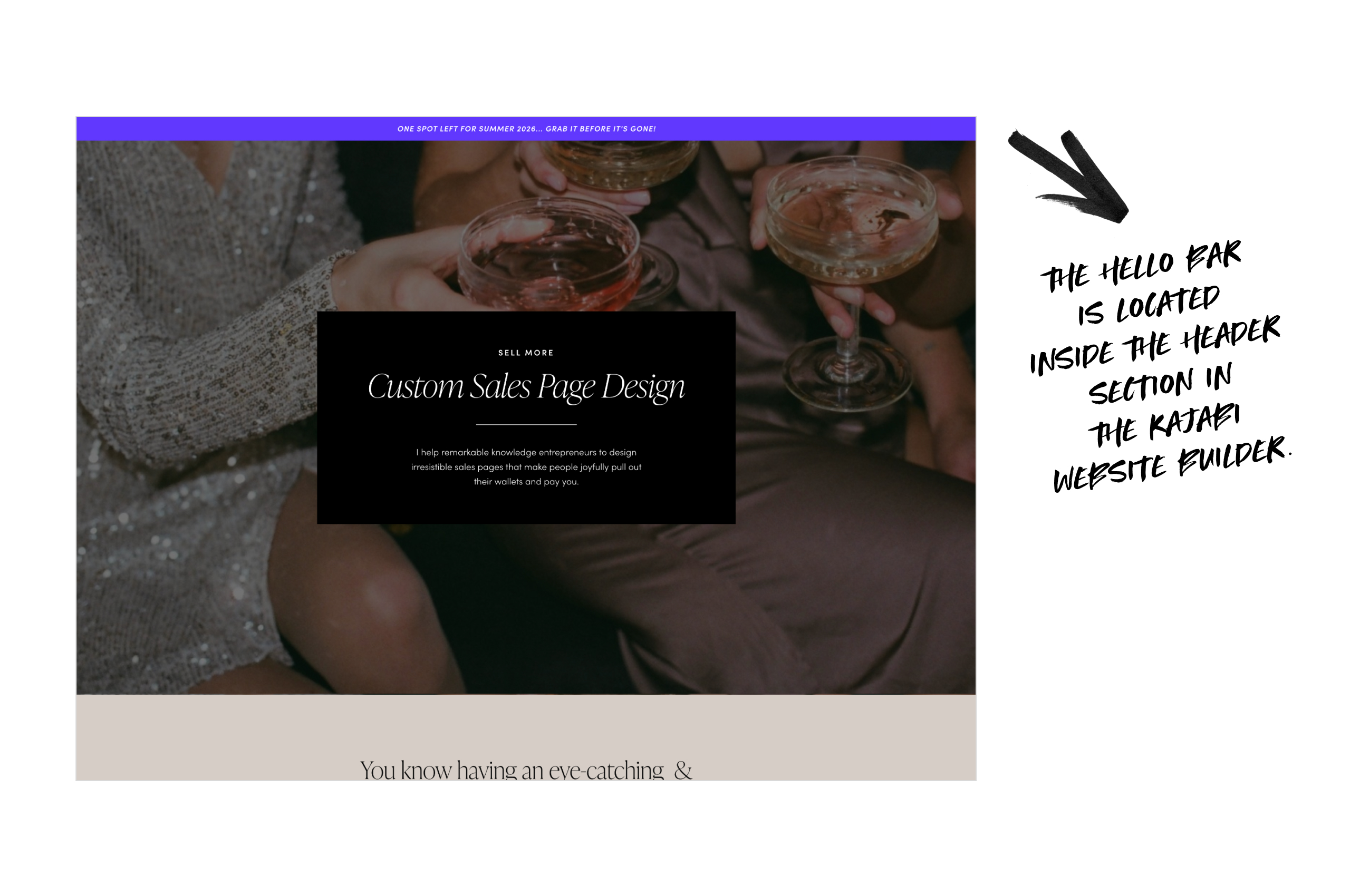
7. Use a Hello Bar for Important Announcements
Persistent top banners can highlight:
-
Cart closing date
-
Limited-time bonuses
-
Program start dates
Why it works: Critical info is always visible without scrolling.
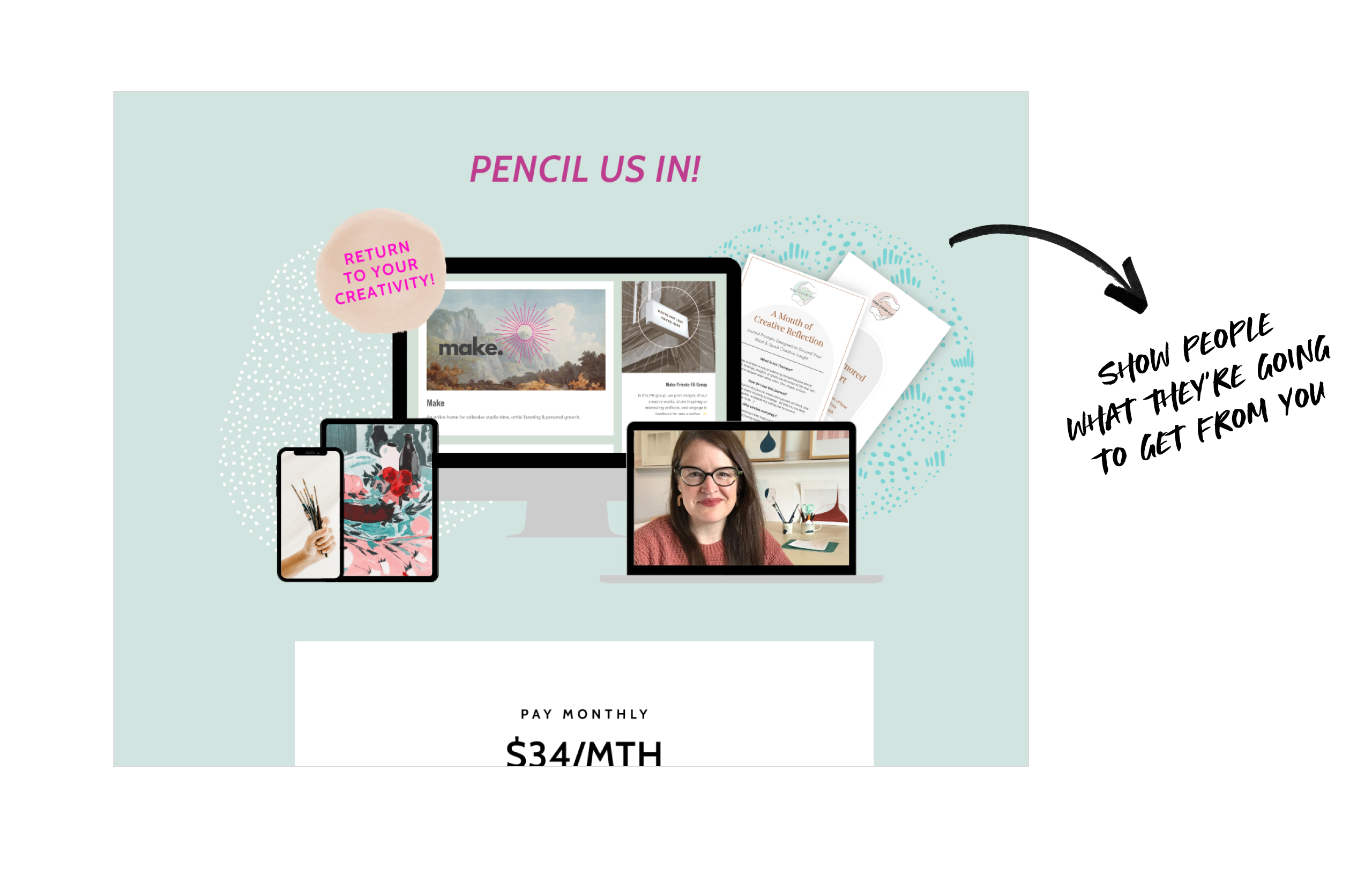
8. Showcase Visual Mockups of Your Products
Show, don't just tell.
-
Include screenshots of your member portal, workbooks or templates
-
You don't have to show everything - just enough to give people a good idea of what they're getting
-
Use different device mockups to show that this is a digital product that's easily accessible
Why it works: Seeing is believing. Visual mockups make intangible products tangible and clear.
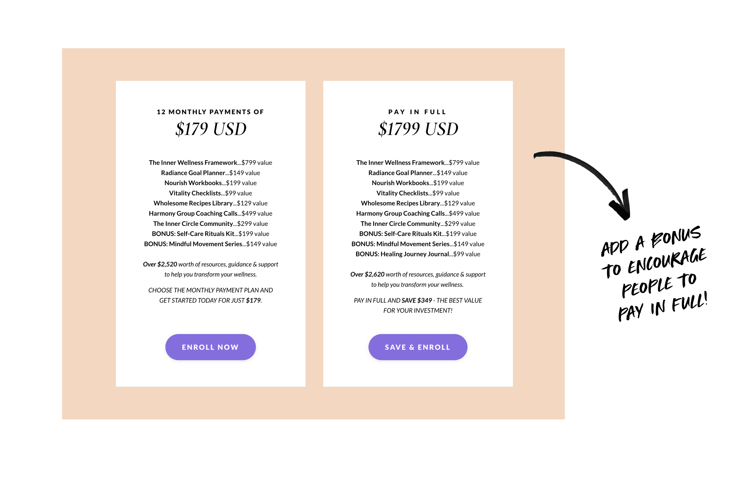
9. Include Clear Pricing Tables
Pricing tables simplify decisions:
-
Label plans clearly
-
Show how much they can save if they pay in full
-
Include CTA buttons for each plan
Why it works: Reduces decision fatigue and speeds up action.
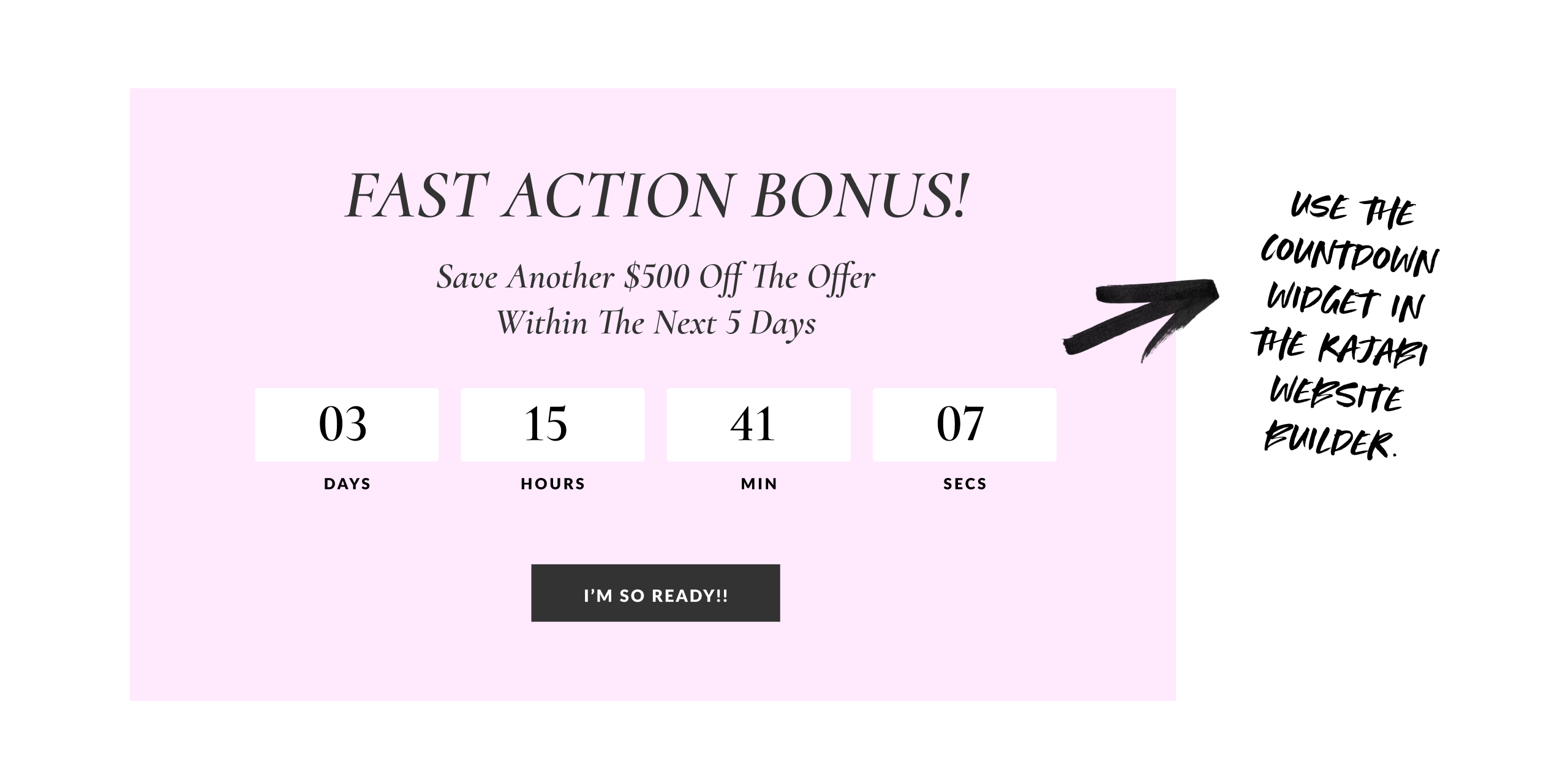
10. Add a Countdown Timer
Timers create subtle urgency.
-
Use real deadlines
-
Place near CTAs or pricing
-
Keep design subtle
Why it works: Scarcity encourages faster decisions.
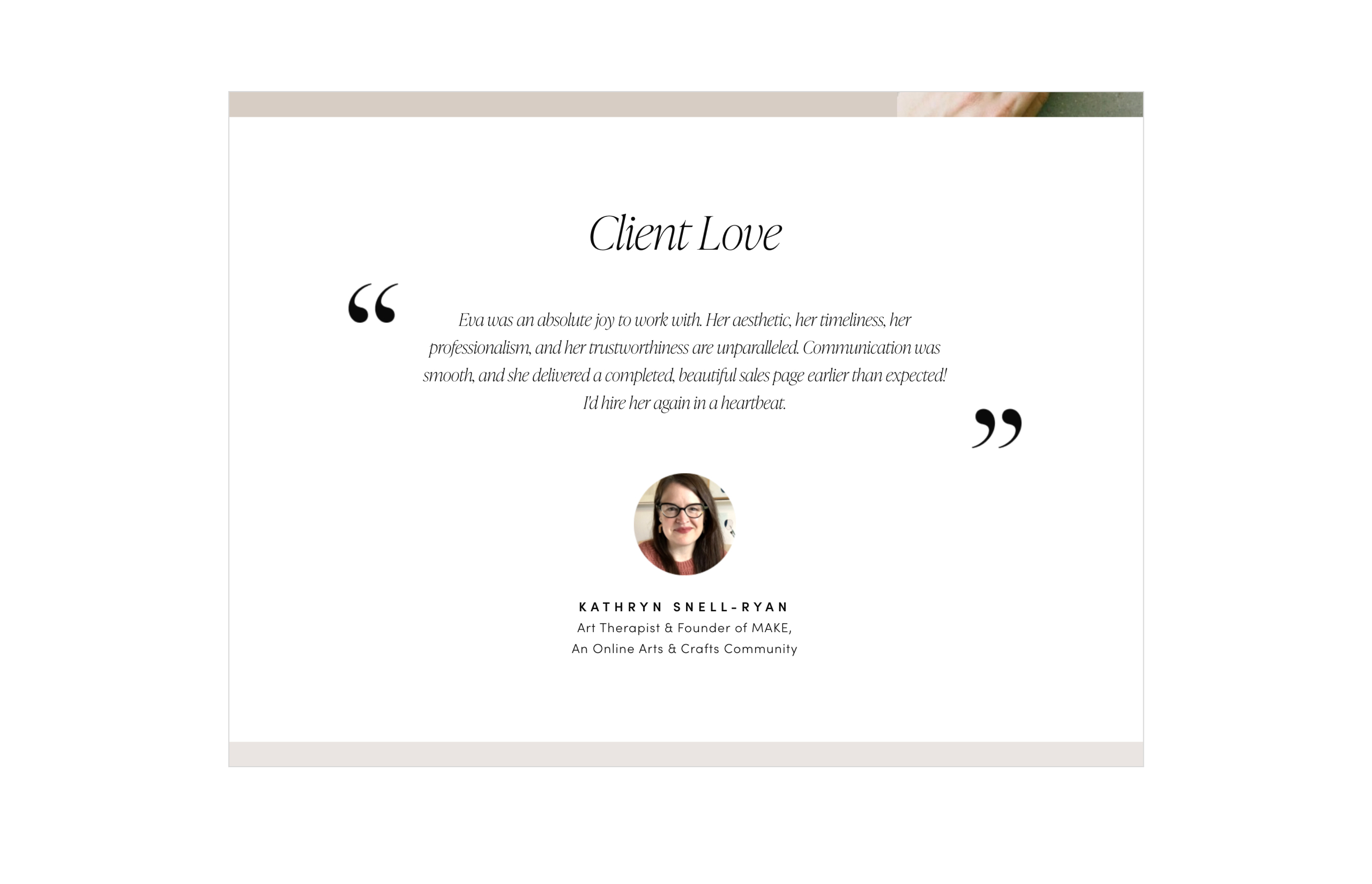
11. Display Testimonials
Social proof builds trust.
-
Text quotes with photos
-
Short video clips
-
Screenshots of messages
Why it works: Real experiences reduce hesitation and reinforce credibility.
12. Add a Satisfaction Badge
Guarantees reduce perceived risk.
-
Simple, on-brand badge
-
Place near CTA or pricing
Why it works: People feel confident knowing there’s a fallback if needed.
![]()
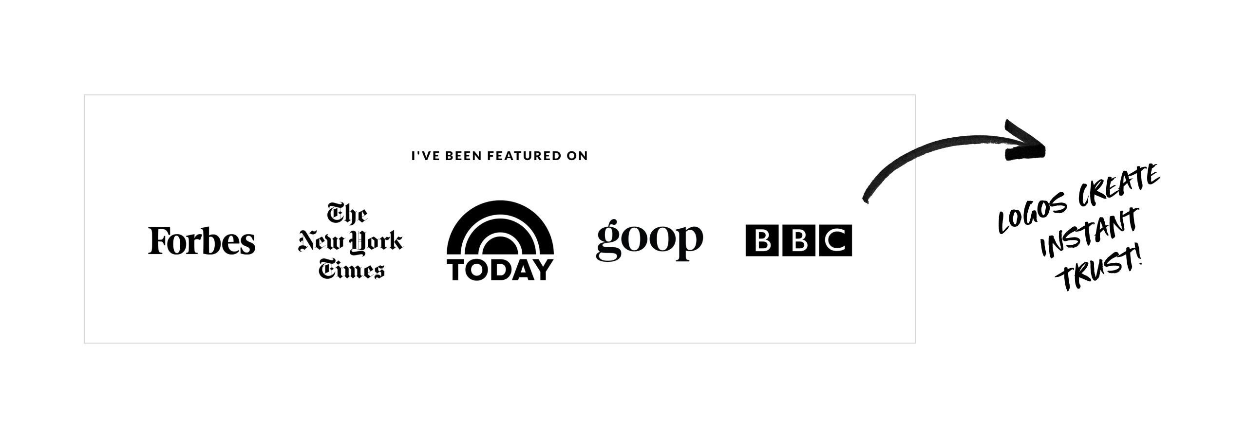
13. Show Credibility With Logos
Display media features, partner brands, or platform logos.
Why it works: Recognizable logos instantly build trust and authority.
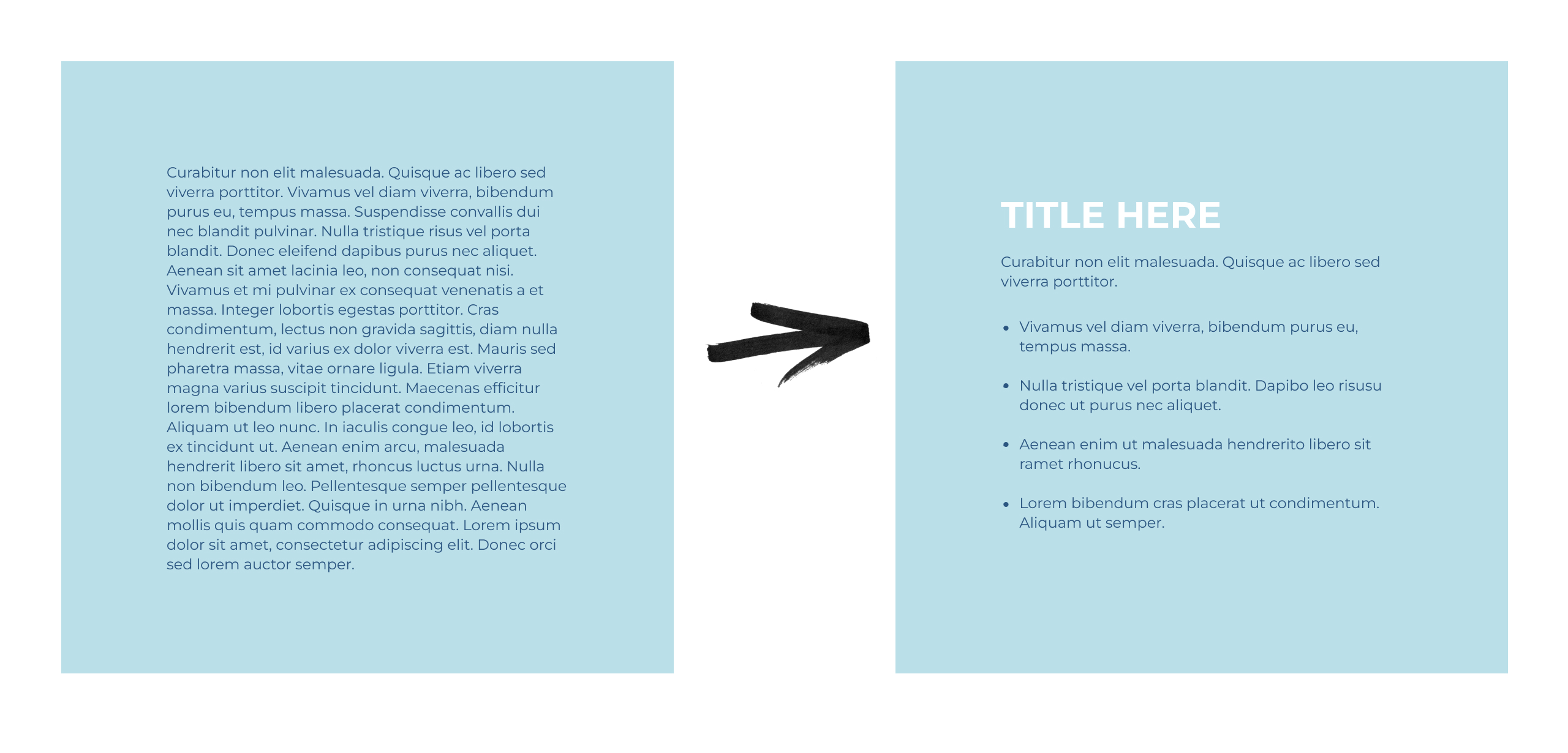
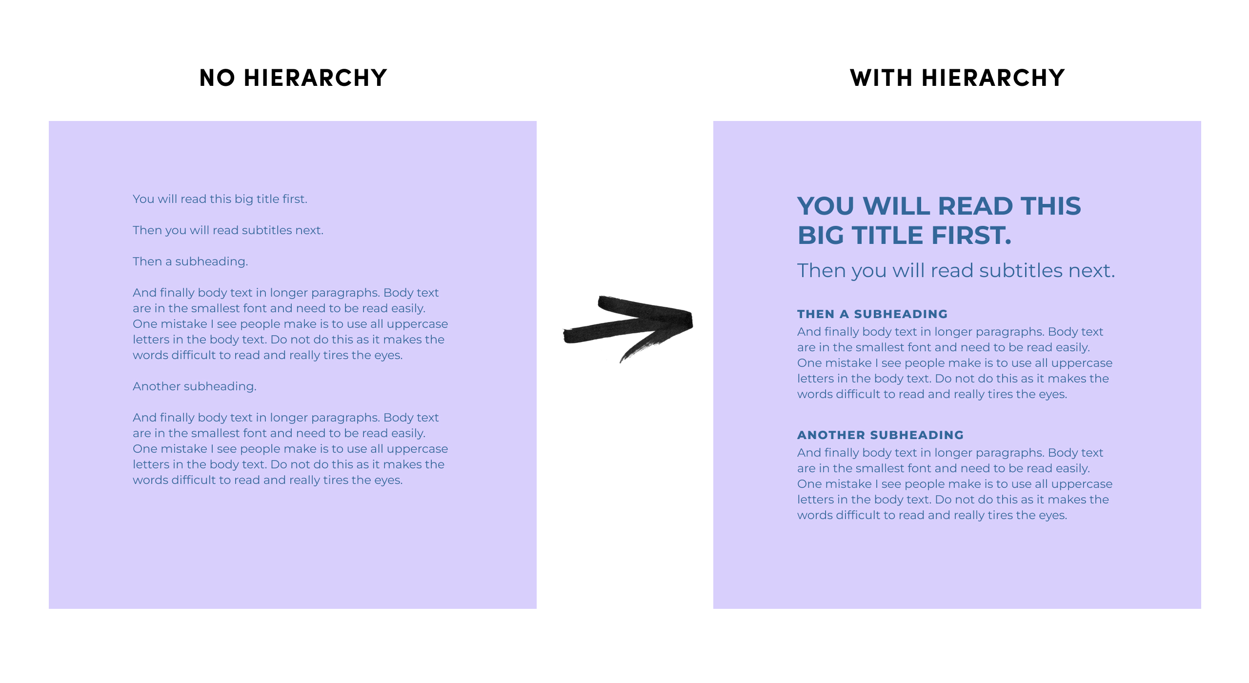
14. Use Clear Visual Hierarchy With Typography
People don’t read a sales page line by line. They scan first. Your typography should make it obvious what to read first, next, and last.
Use a large headline, smaller subtitles, clear subheadings and easy-to-read body text. Avoid all caps for long paragraphs, as they’re harder on the eyes.
Why it works: Clear hierarchy makes your page easier to scan and more comfortable to read — so visitors stay longer and keep scrolling.
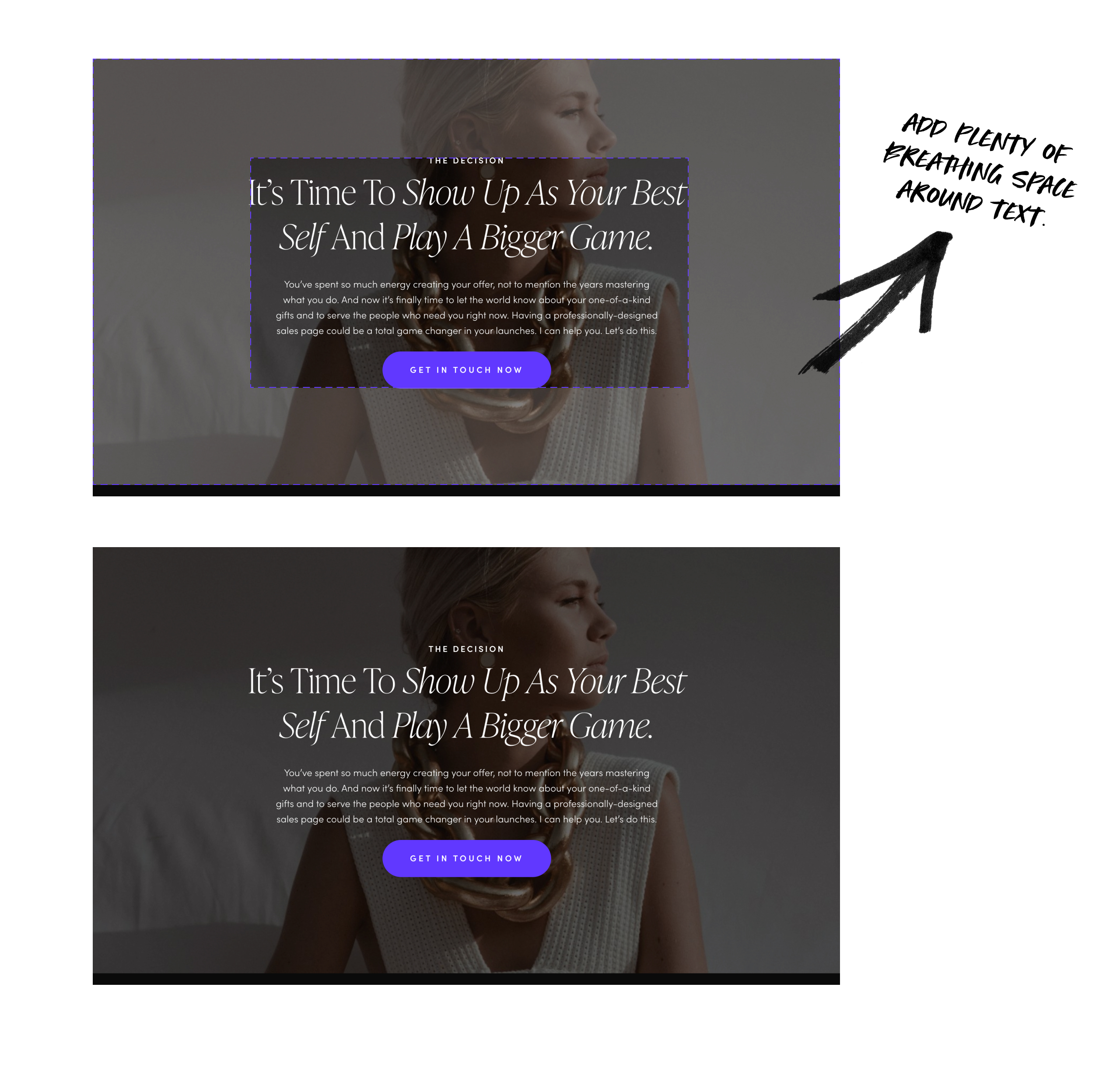
15. Use Whitespace Generously
Spacing makes your page easier to read.
-
Add padding around sections
-
Avoid cramming elements together
-
Let content “breathe”
Why it works: Clean layouts reduce stress and improve perception of quality.
Final Thoughts
By using these strategic design tips, you’ll create a sales page that feels true to your brand, easy-to-navigate and highly persuasive — guiding visitors smoothly from curiosity to becoming happy clients.
Hello & Welcome

Let Your Light Shine,